
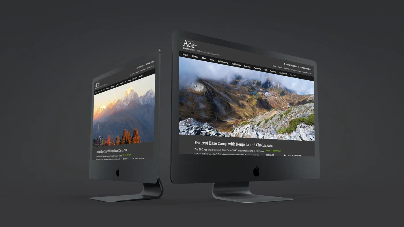
Four countries of trips, rebuilt around how a traveller chooses.
Ace the Himalaya · Treks and tours in four countries · 2015 to 2018
- Strategy and architecture
- Wireframes
- Interface design
- WordPress and WooCommerce build
The same facts on every trip
Ace the Himalaya sells treks and tours in Nepal, Bhutan, Tibet and India, with offices in Nepal, North America, Europe, Indonesia and South Korea, and does all its business through its website. A traveller comparing trips needs the same facts in the same place on every page. It needed a new structure, not a new coat of paint.
Structure first, then screens
We began with strategy sessions and the site’s architecture, then wireframed every template in 2015: the home page with search and bestsellers, the trip page, the help and offers blocks, and a footer with trips for all four countries and each office’s contact details.
The decision first, the detail after
Each trip page leads with what a traveller compares:
- Days and cost
- Grade and maximum altitude
- Daily walking hours
- Where the trip starts and ends
The itinerary, dates, inclusions, equipment, photos, questions and reviews sit behind tabs.
A dark frame for bright mountains
The site is set in near-black, charcoal and off-white, so the mountain photographs carry the colour. Four bright accents mark what to act on and what is on offer: blue, green, coral and orange. Domine sets the headings and Montserrat the rest.
Three ways in
The four countries run across the top. Under them, a traveller can find a trip, customise one, or start from what others booked. We built it on WordPress, with WooCommerce for booking; interfaces followed through 2016 and the last screens in 2018.
Every page a traveller looks for
Beyond the trip pages, we designed:
- A trip finder that filters by price, length, departure date, activity and country
- The company, its volunteers and its representatives abroad
- A blog about the trips, the culture and the places to go
Your business could be the next case study.
A few lines are enough. Monday to Friday, we reply within an hour with our first questions.
Tell us about your businessNext: Himalayan Care Hands, or all case studies.