
One brand for an adventure company, from its first year.
Mega Adventures International · Trekking, mountaineering and tours · since 2012
- Brand identity
- Sitemap and wireframes
- Website, desktop and mobile
A brand with its own parts
One mountain mark, six colours, four typefaces and a set of trip icons. Every page, brochure and post is built from the same parts.
The site, mapped before it was drawn
We planned the website as a sitemap first:
- Treks, mountaineering and tours, each leading to a trip page and its booking
- Special offers and a trip finder
- Trips beyond Nepal, in India, Tibet and Bhutan
- Filming in Nepal, and a blog
Wireframes followed for each template.
A home page that opens on a trip
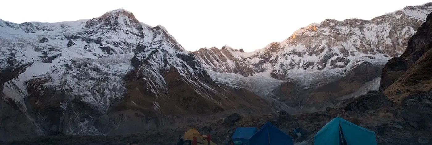
The home page opens on one trip, full screen, then lets a traveller choose by kind: trekking, mountaineering or tours. After that come:
- Mega’s special trips
- Essential travel information: visas, the best time to go, health, and money
- Stories and photographs from the trail
- The team, and the company’s Hike for Nepal community work
On a phone it is the same page, in one column.
Trip pages that sell the trip
Each trip page opens on the place, then the price, duration and a booking button. Fixed departures sit in a table with dates, cost and status, and the itinerary, reviews and gear list follow in tabs. The same pages work on a phone and a tablet.
Your business could be the next case study.
A few lines are enough. Monday to Friday, we reply within an hour with our first questions.
Tell us about your businessNext: Hotel Jal Mahal, or all case studies.