
A resort’s brand, drawn from the water it is named for.
Hotel Jal Mahal · A family resort in Pokhara · 2017
- Brand identity
- Stationery
- Wireframes
- Website
- Online campaign
A water palace in Pokhara
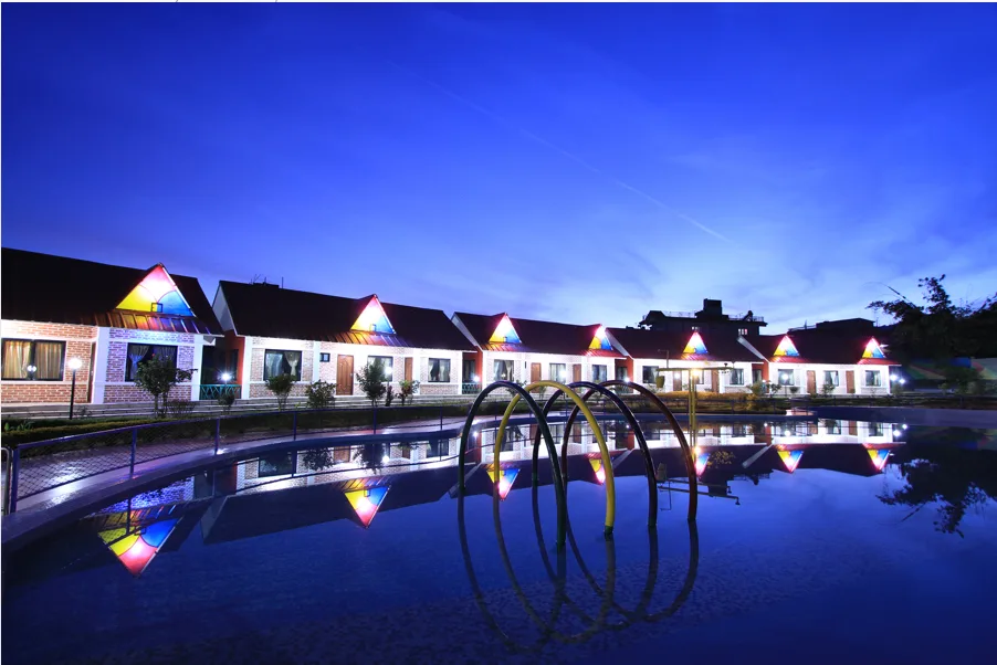
Hotel Jal Mahal is a family-run resort in Pokhara, for tourists and local families. The Himalaya reflects in its infinity pool; younger guests have a small theme park. Its owners wanted a new brand for the resort, then called Himdrishya, and asked us in at the first step.
We started at the resort
We visited and talked with the family who run it. Their children played in the gardens while they showed us round. It felt less like a hotel than a home, and that became the brief.
The colour of the sky in the pool
The brand takes one shade of blue from the sky reflected in the pool, Jal Mahal Blue, with black and white beside it. The logo follows the water in the pool and the plants in the garden.
From the folder to the website
We designed and printed the stationery: folder, letterhead and business cards. The website stayed simple, led by photographs of the resort inside and out, and an online campaign followed.
A website that feels like a stay
The website had to feel like the resort: a simple interface, gentle movement and clear photographs of the rooms, the pool and the gardens. The wireframes set three rules before any design:
- The home page is one photograph of the resort, full screen, changing on each visit
- It loads as fast as it can, with nothing to scroll
- A promotion appears only while one is running
The same pages work on a tablet and a phone.
Your business could be the next case study.
A few lines are enough. Monday to Friday, we reply within an hour with our first questions.
Tell us about your businessNext: Ace the Himalaya, or all case studies.